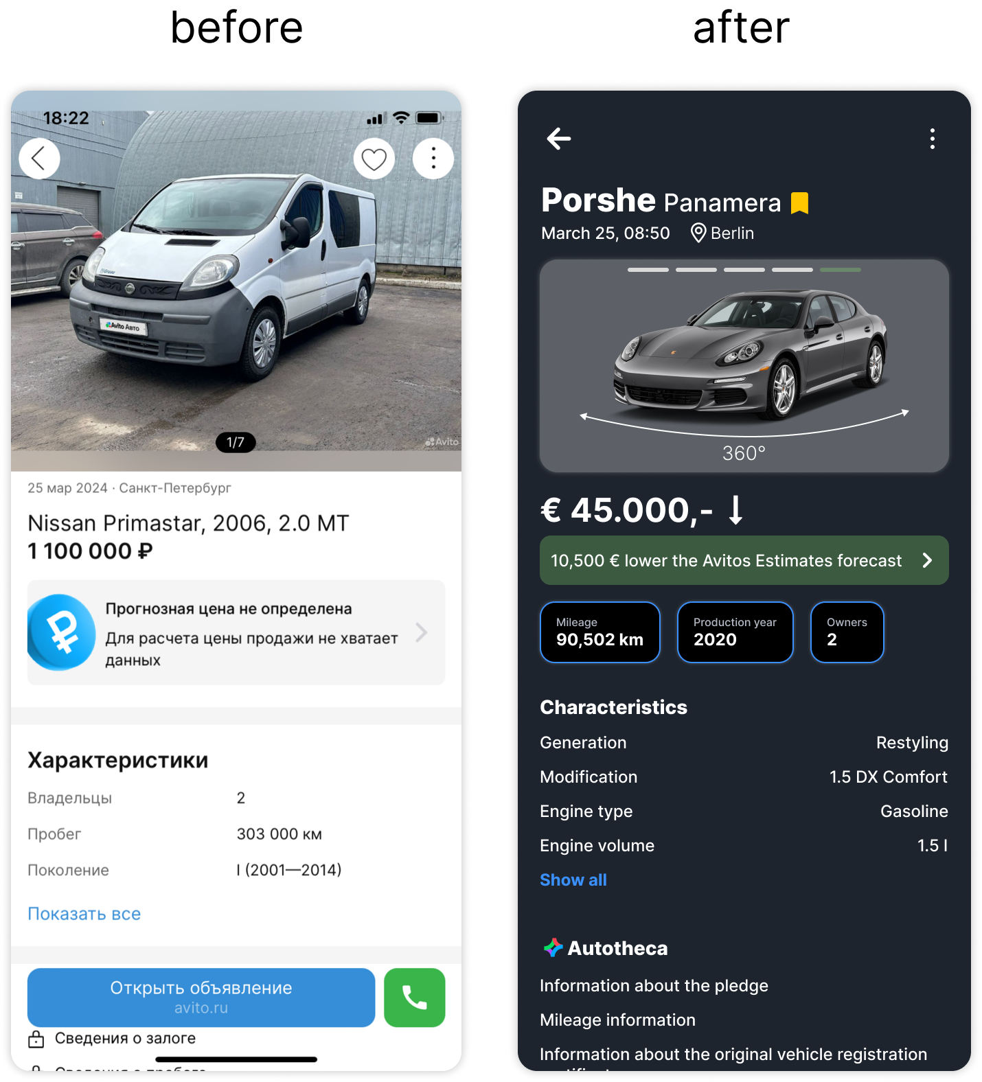
Car Resale App redesign
A UX/UI Case Study on Enhancing Trust for resales
Project Overview
This project focused on redesigning a car resale application with the main goal of building trust with resellers, improving usability, and ensuring the interface reflects professionalism and competence.
Existing functionality was analyzed, a competitor analysis was conducted, and a user-centered design approach was implemented to create a more intuitive and appealing interface.
Design Goals
Increase Trust
The design aims to create a trustworthy atmosphere for users by using a professional and clean visual interface.
Professional Tone of Voice
The visual elements evoke competence, literacy, and professionalism. Text is precise and straightforward, avoiding bureaucratic jargon.
User-Centered Functionality
The redesign ensures the app is user-friendly, making it easier for users to find and evaluate car listings with enhanced usability features.
Competitive Analysis
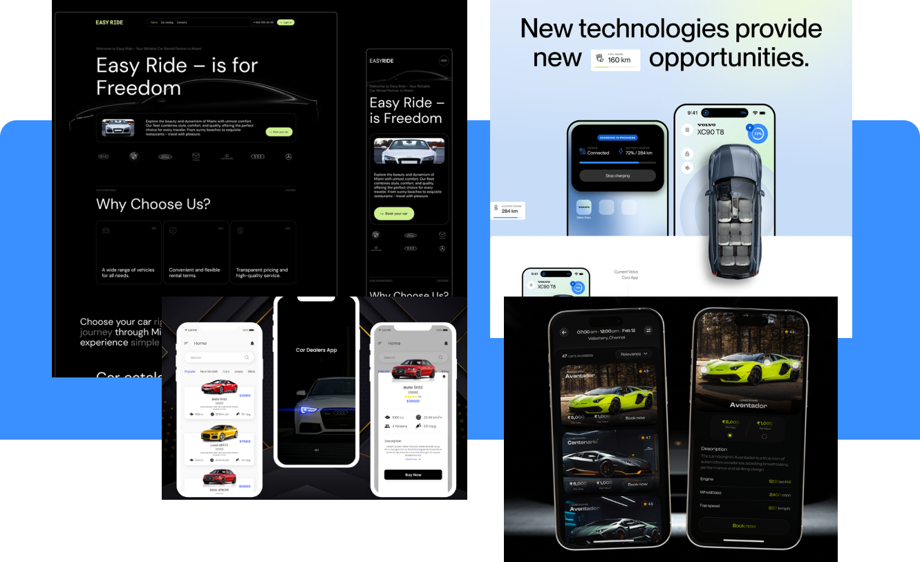
An in-depth analysis of direct competitors in the market was conducted. While the functionality was similar across the board, all competitors shared outdated visuals. This informed our decision to focus on modernizing the design with clean, professional aesthetics.
We also identified key areas where competitors excelled and where they fell short, ensuring our redesign would effectively stand out in a crowded market.
Color Scheme and Style

To create a sense of trust and professionalism, we selected a color palette that includes dark blue, green
and light blue. These colors are aimed at conveying seriousness and competence, particularly to a male audience.
We chose a clear, legible sans-serif font that is well-suited for displaying large amounts of information while maintaining a serious and professional tone.
The use of slightly rounded forms ensures the interface is approachable yet retains a professional distance.
Final Design
Car Listing Page
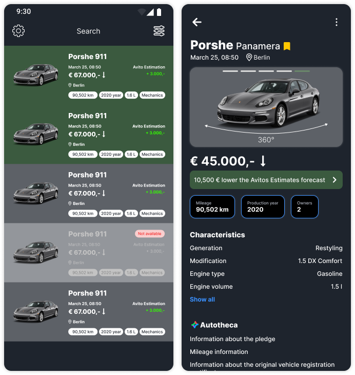
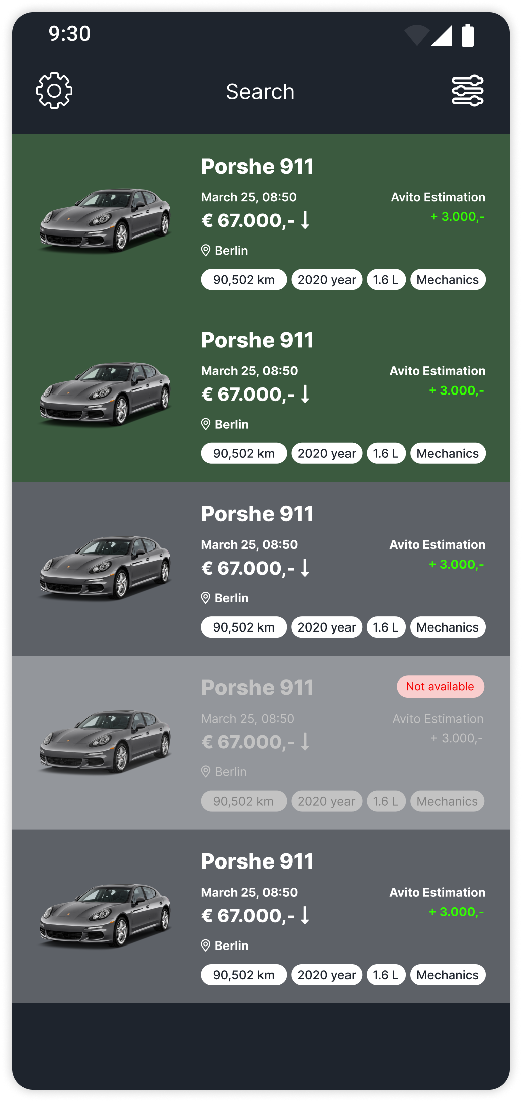
The car listing page was designed in a list format, enabling users to easily scan and compare multiple vehicles. Key information such as price, location, and condition is prominently displayed.
Car Detail Page
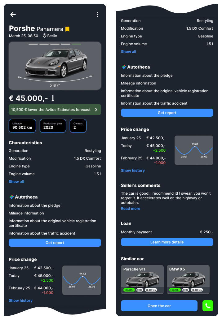
On the car detail page, essential details like model, publication date, and location are highlighted. The page also includes advanced features like a 360-degree image viewer and price history charts for better decision-making.
Enhanced User Interaction
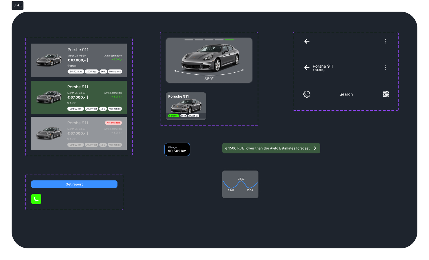
User interactions were enhanced with features like bookmarking, easy navigation, and an intuitive layout that prioritizes the most important information, improving overall user experience.
Conclusion
Car Listing Page
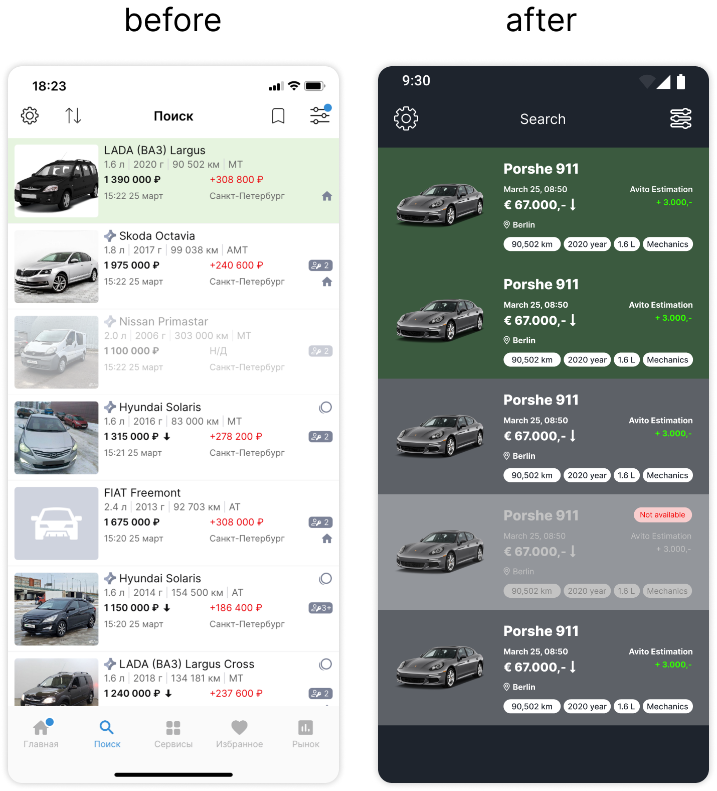
The list of cars was left in list format. Displaying the list in this form allows you to more clearly see a larger amount of information, both visual and textual.
Car snippet
The order of the fields has been changed for better understanding of the information.
Date of publication - the date is displayed first, then the time. (date has priority over time).
Important parameters are displayed using chips (for emphasis of this information and better visual reading).
Added a geolocation icon to separate this information from the price.
Added the signature “Avito Rating” to the figure (I was convinced from my personal usability testing that the information is not obvious, and you can only find it out from stories).
The remaining icons have been removed (number of owners, placement on several services, etc. for the same reason as in the previous paragraph - they can be placed in the characteristics of the car).
Added indication for unavailable ad.
What can be improved?
Conduct research (card sorting, quantitative survey) on users in order to find out what information on the list is the highest priority for them.
Based on the research results, display the most necessary parameters in the auto snippet.
Explore which list display format is more convenient for them / or add the ability to switch the list to grid mode.
Car Detail Page
The model name, publication date, time and place are located above the photo (since this is the primary information that allows you to form a basic idea).
The add to favorites icon has been replaced with a bookmark (we're talking about serious matters, what kind of hearts are they?).
Previously, the application allows you to crop the background of the image.
First, the application offers to take a photo of the car from such angles to make a 360-degree panorama.
The Avito rating forecast banner has been reduced so as not to take up useful space.
Important parameters (mileage, year of manufacture, owners) are placed in separate blocks for better reading of important information without searching by characteristics.
All blocks from the current card have been saved (Characteristics, Car Library, Seller's Comments, Similar Ads) + the Credit block has been added, since it is clear from stories/competitor analysis that this is an important functionality.
A functionality graph has been added to the price change for quicker and easier perception.
Similar advertisements are displayed as cards with cars.
When you scroll the card, the Top App Bar is fixed and contains the name and price of the car. Bottom Bar is also fixed.
What can be improved?
Research what information is the highest priority for users and place it in place of individual blocks (currently there are mileage, year of manufacture, owners).
Add additional information fields to the “Credit” block based on the needs of users and business.
Conduct usability testing on real users to determine the understandability of the interface content.
Conduct usability testing on real users to determine the sufficiency of information.
