01The problemDas Problem
One dashboard, two roles. Contractors track their own crews, segments and documentation in the field; employers oversee progress, budgets and quality across many contractors. Their task hierarchies are fundamentally different — but the layout treated them as one user.
Ein Dashboard, zwei Rollen. Auftragnehmer verfolgen ihre eigenen Teams, Segmente und Dokumentationen im Feld; Auftraggeber überwachen Fortschritt, Budgets und Qualität über viele Auftragnehmer hinweg. Ihre Aufgaben-Hierarchien sind grundlegend verschieden — das Layout behandelte sie jedoch als einen einzigen Nutzer.
The hypothesis: the existing layout didn't reflect how either role actually works.
Die Hypothese: Das bestehende Layout spiegelte nicht wider, wie eine der beiden Rollen tatsächlich arbeitet.
02Research: the plan, and the plan B that shippedResearch: der Plan — und der Plan B, der umgesetzt wurde
The research-first proposal: 15–20 discovery interviews across both roles, plus usability tests observing first-click behavior and hesitation points. That was the right way to test the hypothesis directly.
Der Research-first-Vorschlag: 15–20 Discovery-Interviews über beide Rollen hinweg, dazu Usability-Tests mit Beobachtung des First-Click-Verhaltens und der Zögermomente. Das war der richtige Weg, die Hypothese direkt zu prüfen.
The budget-constrained alternative that got executed: a structured competitive analysis of 3 GIS platforms — IQGEO, MAPX, and DroneDeploy/Pix4D — examining how domain leaders organize the same job.
Die budgetbedingte Alternative, die umgesetzt wurde: eine strukturierte Wettbewerbsanalyse von 3 GIS-Plattformen — IQGEO, MAPX und DroneDeploy/Pix4D — mit Blick darauf, wie Marktführer der Domäne dieselbe Aufgabe organisieren.
03Design decisionsDesignentscheidungen
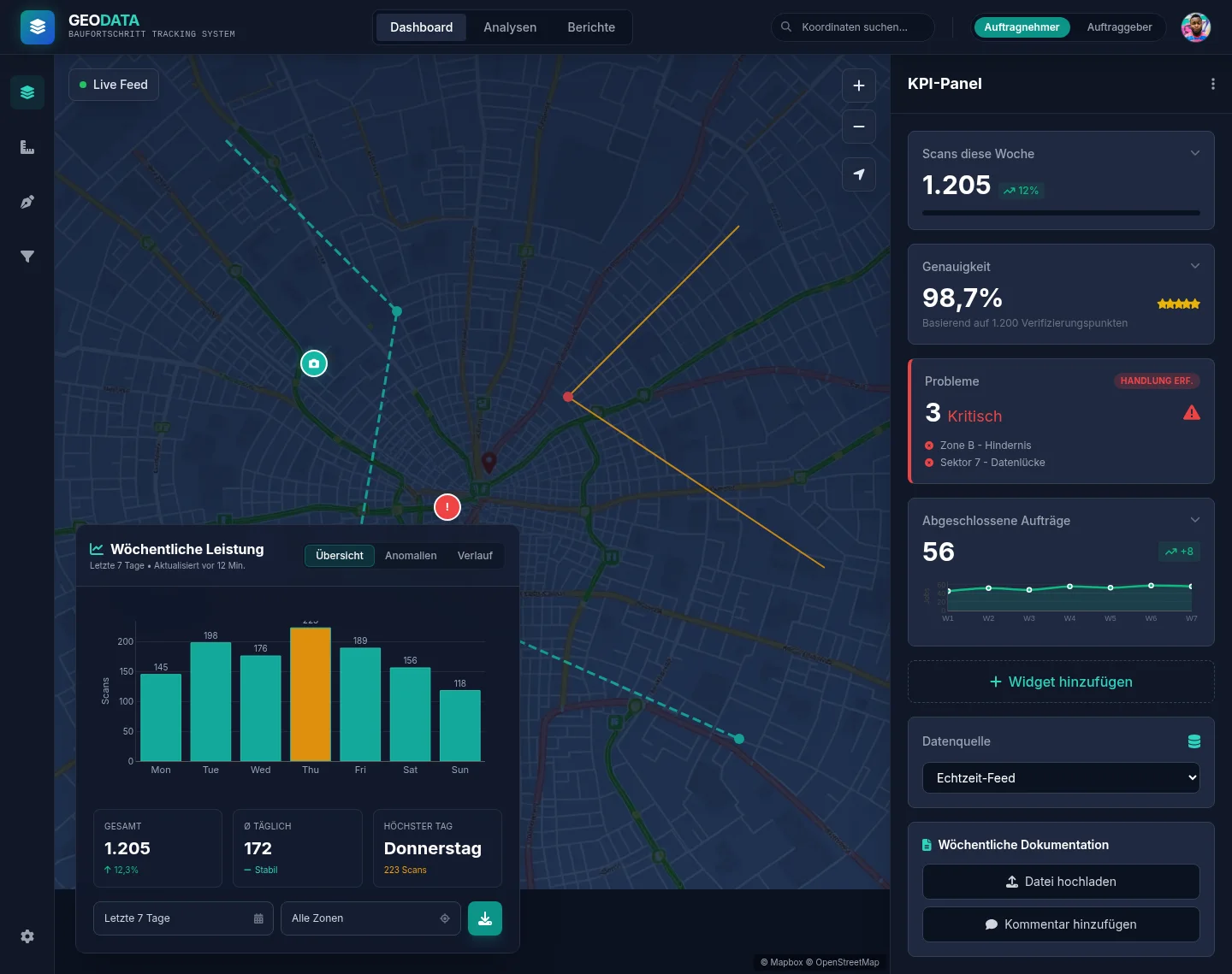
Map first. The map gets 70–80% of the screen, plus a fullscreen mode for field-style work. Everything else earns its place around it.
Map first. Die Karte erhält 70–80% des Bildschirms, dazu einen Vollbildmodus für feldnahes Arbeiten. Alles andere muss sich seinen Platz drumherum verdienen.
Modular KPI rail. Widgets can be added, removed, reordered and configured — so contractors and employers each assemble the KPIs their role actually needs, instead of sharing one compromise layout.
Modulare KPI-Leiste. Widgets lassen sich hinzufügen, entfernen, umsortieren und konfigurieren — so stellen sich Auftragnehmer und Auftraggeber jeweils die KPIs zusammen, die ihre Rolle wirklich braucht, statt sich ein Kompromiss-Layout zu teilen.
Collapsible analytics panel. Deep analysis is one click away but never steals space from the map by default.
Einklappbares Analytics-Panel. Tiefe Analysen sind einen Klick entfernt, nehmen der Karte aber standardmäßig keinen Platz weg.
Contextual documentation panel. Selecting a network segment opens its documentation in place: attach a document, upload a photo, leave a comment — without leaving the map.
Kontextuelles Dokumentations-Panel. Die Auswahl eines Netzsegments öffnet dessen Dokumentation direkt an Ort und Stelle: Dokument anhängen, Foto hochladen, Kommentar hinterlassen — ohne die Karte zu verlassen.
Widget-add flow. A guided three-step flow: choose the visualization type → pick the data source → set the time range.
Widget-Anlege-Flow. Ein geführter Drei-Schritte-Flow: Visualisierungstyp wählen → Datenquelle auswählen → Zeitraum festlegen.
04Measuring it: analytics designed up frontMessbarkeit: Analytics von Anfang an mitgedacht
Instead of bolting tracking on after launch, the event taxonomy was designed alongside the interface: dashboard_open, map_segment_click, widget_add / widget_remove, filter_apply — each event tagged with the user's role. From day one, the data can answer the original question: do contractors and employers actually use the dashboard differently?
Statt Tracking nach dem Launch anzuflanschen, wurde die Event-Taxonomie parallel zum Interface entworfen: dashboard_open, map_segment_click, widget_add / widget_remove, filter_apply — jedes Event mit der Nutzerrolle getaggt. So können die Daten vom ersten Tag an die Ausgangsfrage beantworten: Nutzen Auftragnehmer und Auftraggeber das Dashboard tatsächlich unterschiedlich?
05Accessibility: WCAG 2.1 AA as a baselineBarrierefreiheit: WCAG 2.1 AA als Baseline
- 4.5:1 minimum color contrast across the UI
- Full keyboard navigation — including the map and widgets
- ARIA roles and labels for interactive components
- 44×44 px minimum touch targets
- Tabular alternatives for every chart
- Mindestkontrast von 4,5:1 im gesamten UI
- Vollständige Tastaturnavigation — inklusive Karte und Widgets
- ARIA-Rollen und -Labels für interaktive Komponenten
- Touch-Ziele von mindestens 44×44 px
- Tabellarische Alternativen für jedes Diagramm
06Mobile: responsive from day oneMobile: responsive vom ersten Tag an
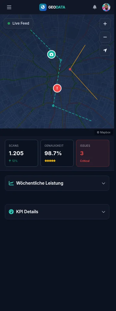
The mobile layout keeps the same logic: a fullscreen map with the KPI strip below it, analytics in a bottom drawer, and primary actions placed within thumb reach.
Das mobile Layout behält dieselbe Logik: Vollbildkarte mit KPI-Leiste darunter, Analytics in einem Bottom Drawer und primäre Aktionen in Daumenreichweite.