Designing Calendar Mobile App for Enhanced Productivity
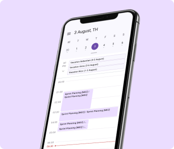
project bio
Project Overview: This real case from work outlines the comprehensive process of creating a new calendar mobile app designed to enhance productivity and streamline event management for users.
Team and Duration: This real-world project was a collaborative effort involving a product owner, a team of programmers and one designer (myself, Elina Karamova). The project lasted 1 year (2023-2024 years).
Business Challenges:
- Market Differentiation: The need to create a standout product in a saturated B2B/B2C market with numerous calendar apps.
- User Acquisition and Retention: Attracting new users and retaining them by offering superior features and a better user experience.
Design Goals: The primary goal was to develop a user-friendly and feature-rich calendar app that caters to diverse user needs, ensuring seamless event scheduling and management.
Users: Company employees scheduling daily work meetings with colleagues on their calendars.
Design procces
1. User Research
Interviews: Conducted extensive interviews with 30 respondents working with mobile calendar apps to understand user pain points, preferences, and expectations.
Each interview followed a structured approach with open-ended questions designed to explore:
- User habits and preferences regarding calendar usage.
- Pain points or challenges experienced with existing calendar applications.
- Desired features and improvements they would like to see.
- Specific feedback on prototypes or concepts related to the features being developed.
Results of interviews:
Planning
- Short and long term planning.
- Operational planning of the current day. Know the “picture” of your day.
- View your calendar during meetings.
- Displaying everything that takes up working time - visibility for yourself and for colleagues.
- View your colleagues' calendar.
- View the directorate's calendar with business trips, vacations and office visits (shared calendars).
- View meeting details: where, with whom, at what time.
Meetings
- I can quickly look at appointment schedules, reschedule, move, and promptly organize a meeting.
- As a rule, full-fledged events are not created/edited from a mobile phone.
- It is not possible to view availability when creating a meeting on a mobile phone.
- It is important to clearly know the start time of the meeting, see which candidate is busy and not be late for them.
- Color different appointments on the calendar in different colors so that you can understand what day is expected without reading it.
- Connecting via a link from an event in a mobile calendar is more convenient than searching on the web and squad.
- Send one letter to all meeting participants with its results.
Push
- “An alert that is always with you.” The main purpose is to receive notifications about meetings on a mobile device, on a watch, or on a fitness bracelet.
- If there was no calendar, I would set myself an alarm clock to remind myself of important/regular meetings.
- The meeting is set up spontaneously, so it is important that notifications about them are promptly received.
2. UX/UI
The functionality of the mobile calendar application was designed and developed iteratively and was divided into several features, which will be described sequentially below.
1. Viewing calendars events in day view mode
1.1 Ideate
The first feature allows users to view their calendar events in a detailed day view mode. This mode provides a comprehensive and organized display of all events scheduled for a specific day, allowing users to easily track their daily appointments, meetings, and tasks. Key functionalities include:
- Clear and Intuitive Interface: A user-friendly layout that highlights each event with time slots, making it easy to understand the schedule at a glance.
- Event Color Coding: Different colors for various types of events (e.g., work, personal, reminders) to help users quickly identify and prioritize their activities.
- Event Summaries: Brief summaries for each event, including the title, time, and location, displayed directly in the day view.
- Quick Navigation: Easy navigation controls to switch between days, ensuring users can efficiently move to past or upcoming dates.
1.2 Competitor analyses
The comprehensive analysis comparing Outlook, Google Calendar, and Apple Calendar across various features and functionalities:
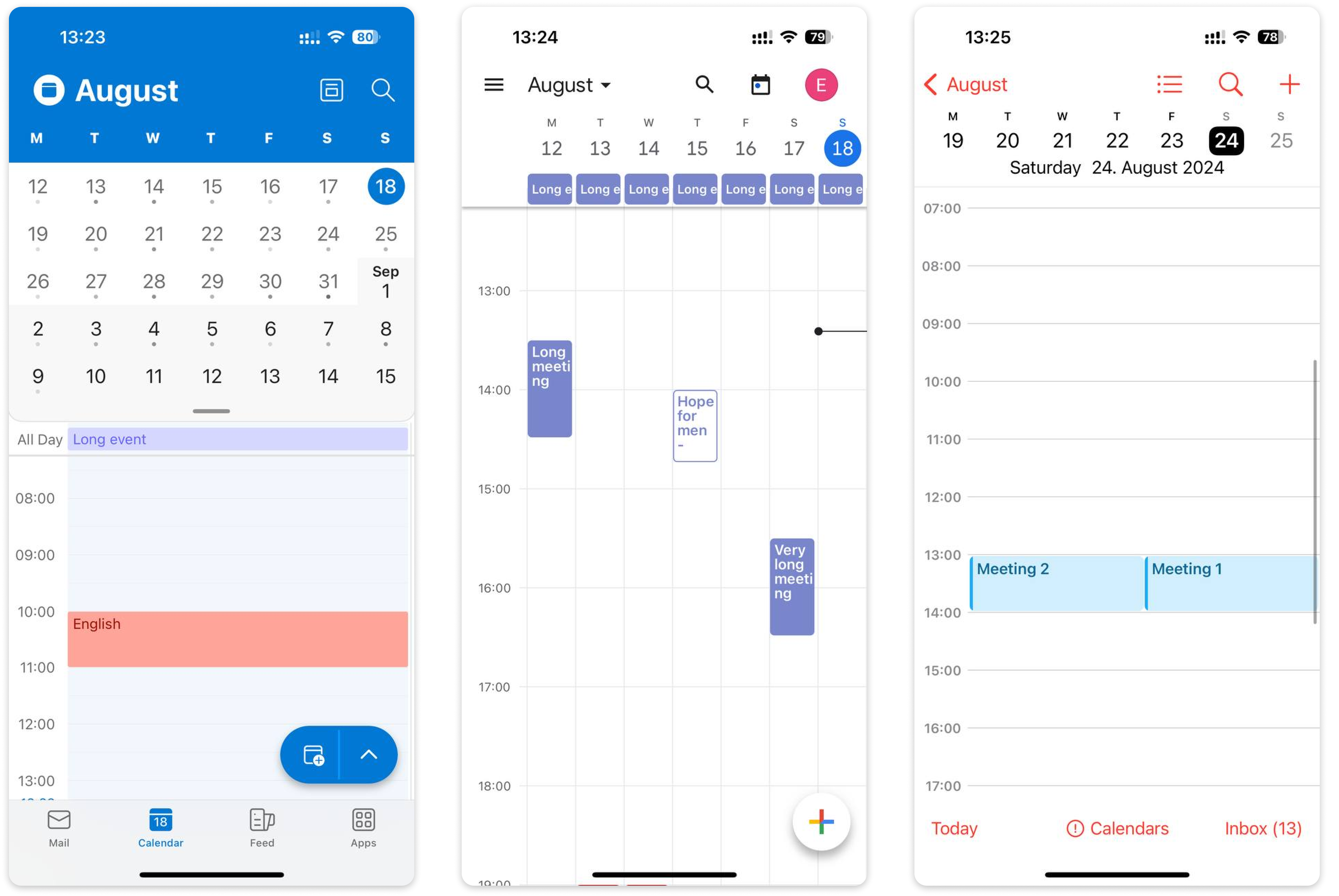
Outlook:
- Visual Representation of Events: Uses "sausages" (blocks or bars) to represent meetings, showing varying lengths to indicate event duration.
- Color-Coded Shared Calendars: Events from different shared calendars are color-coded for easy differentiation.
- Mode Switching and Navigation: Top toolbar with distinct icons for day, week, and month views facilitates easy toggling between different calendar views.
- Navigation Between Days: Users tap on a date panel to switch to desired days instead of scrolling, simplifying navigation.
- Month Overview in Top Panel: Allows users to expand and scroll within the calendar, with days marked by dots (1-3) to indicate activity level. Events without accepted invitations are not displayed.
Google Calendar:
- Calendar Access via Month Tap: Tapping on the month expands it to show detailed views and options.
- Day Selection and Scrolling: Days remain selected within the calendar view, maintaining focus during scrolling.
- Event Search Capability: Includes a search feature displaying results on the final screen for quick event retrieval.
- Month Navigation: Allows intuitive swiping left to right to navigate between months.
Apple Calendar:
- Primary Viewing Mode - Schedule Mode: Primary viewing mode is the schedule mode, where the calendar occupies half of the screen. This mode emphasizes a list or timeline view of events, making it easy for users to see their daily schedule at a glance.
- No Time Grid Display, Only Event Times: Simplifies the display by showing only the times of scheduled events without a visible time grid. This design choice reduces visual clutter and focuses solely on event details.
- Event Indicator Dots: Days with events are marked with dots (1-3), providing a visual cue of daily activity levels.
- Day Navigation via Tap: Users navigate between days by tapping on each day individually, which switches the calendar view to that specific day. This method simplifies day-to-day navigation within the calendar interface.
Results: Based on the analysis of competitors, a decision has been made to implement a list view mode displaying events as "sausages" to represent their duration. At the top of the page, there will be an expandable calendar showing busy times, with swipe and scroll gestures enabled. Tapping on an event will open a detailed view with editing capabilities.
1.3. UX/UI
For the design system, I've developed the following components adhering to the M3 Material Guidelines:
- Calendar (Event Date Picker)
The calendar is minimized by default and expands to push down the current time grid view, showing the busy state of the calendar in both modes.- Day View Header: Displays the selected date in the format "Day Number + Month + Weekday" (e.g., "3 August, Thu").
- Time Grid (Day View):
- Time Lines and Current Time Indicator: Shows gray time lines and a red current time indicator, ensuring clarity by overriding time lines when they coincide.
- Event Snippets:
- Mechanisms for Overlaying Events: With different states for event snippets, such as ongoing, all-day events, and events spanning multiple days.
- Navigation Bar:
- Maintains Current View: Maintains the current view upon switching to the "Calendar" tab and shows the current date and time upon tapping the calendar icon.
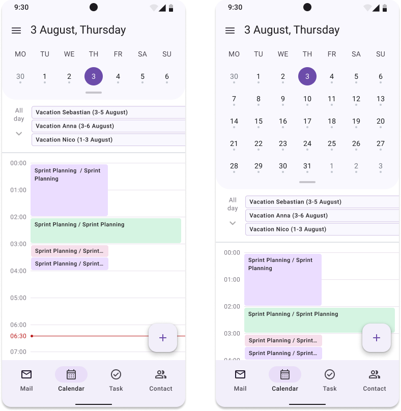
- Maintains Current View: Maintains the current view upon switching to the "Calendar" tab and shows the current date and time upon tapping the calendar icon.
Interaction and Swiping Functionality:
- When you select NOT the current day in the calendar, events are displayed according to the selected day.
- The calendar will scroll in its collapsed and expanded state.
- The time grid has a swipe “left” and “right”. When swiping events for another day: events are displayed immediately. Swipe area: 30% to the left and right of the screen width. When you swipe events in the expanded calendar mode, the calendar does not collapse.
- When scrolling between days, the selected grid view is saved.
(For example, if the time range of the grid is displayed from 06:00 to 14:00, then when scrolling, the view with the same range is saved; then if the displayed range has changed, for example, from 10:00 to 15:00, then now when scrolling it is displayed view with a new range, etc.).
Corner cases:
- If the event is before 23:59 hours of the current day, then it is displayed in the current day.
- If an event started at 0:00, then it is displayed on the next day.
- If an event started today but continues tomorrow, then part of it is displayed in the current day and part in the next.
2. Navigation between calendars
2.1 UX/UI
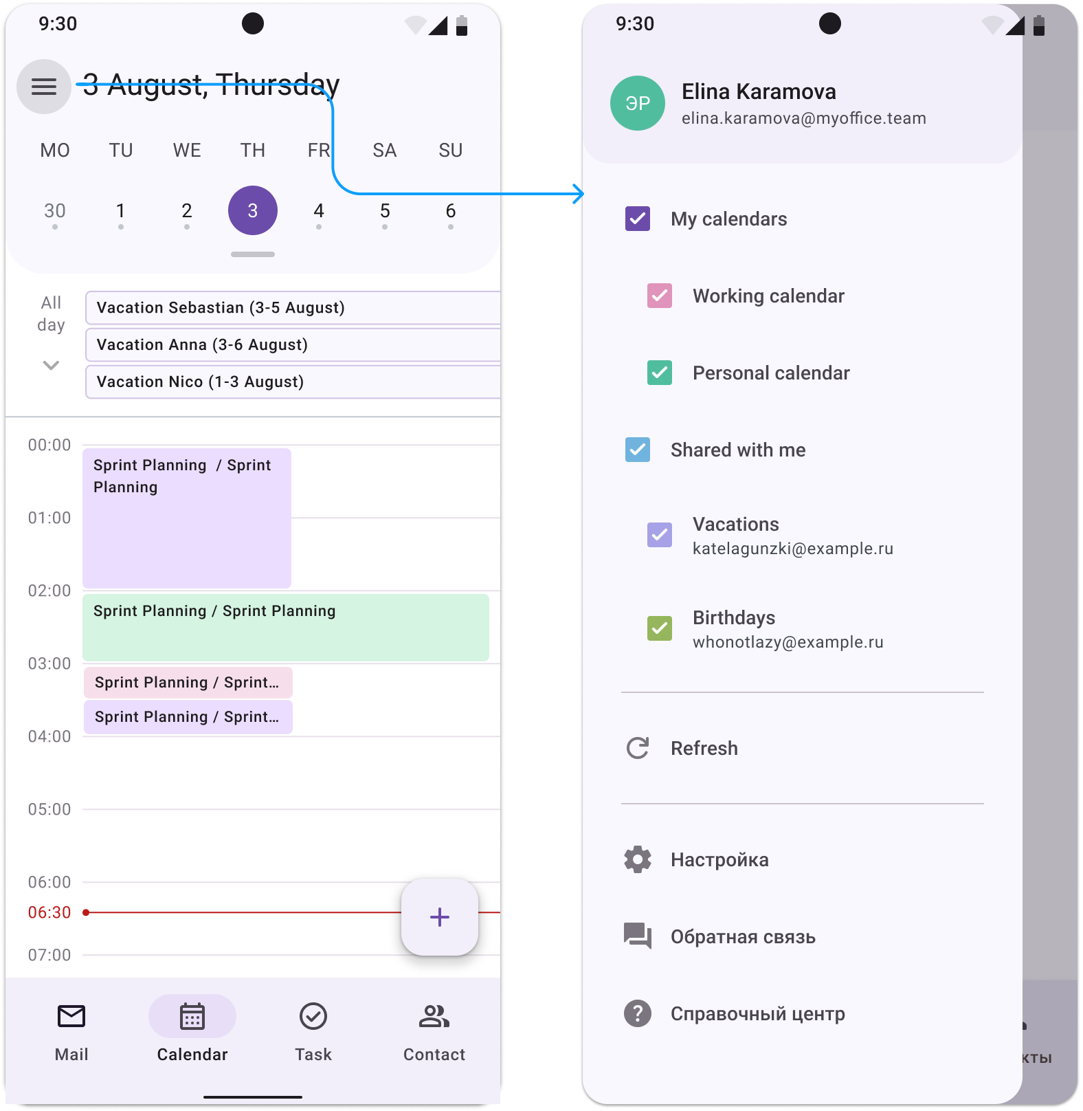
Navigation within the calendar is displayed in the "Drawer" component. The drawer covers the entire body area, providing key navigation between application components. The driver does not cover the Status Bar. Account data is displayed at the top, then a list of calendars, a data update button, and at the bottom there are links to general sections (settings, feedback, help center).
All connected calendars are displayed in one list. By default, all calendars are enabled. When a new calendar is added to the list (for example, a new calendar was shared with the user), it appears enabled by default.
The user can control the visibility of both all calendars and individual types. Types of calendars are on the first level, the calendars themselves are on the third level.
All calendars are grouped into two types:
- My calendars — custom calendars. We display only the name.
- Shared access — calendars with shared access. We display the name and address of the calendar owner. If the user does not have shared calendars, leave the title and hide the checkbox.
Corner cases:
- We collapse long names of calendars and addresses into ellipses.
- The sorting of calendars corresponds to the sorting of calendars in the account.
- The main calendar is always displayed first.
- Sorting of calendars should correspond to sorting on the web (default + alphabetical order).
3. Creating events and editing fields
3.1 Ideate
The second feature provides users with the ability to view and edit all the details of their events. This comprehensive editing functionality ensures that users can manage their calendar events with precision. Key functionalities include:
- Detailed Event Information: Users can access full details of each event, including title, description, location, start and end times, reminders, and participants.
- Edit Mode: An intuitive edit mode that allows users to modify any field of an event. This includes changing the event time, updating the description, adding or removing participants, and setting or adjusting reminders.
- Real-time Updates: Immediate reflection of changes in the calendar, ensuring that all updates are accurately and promptly displayed.
- Notification: Reminders for upcoming meetings so you don't miss anything important.
3.2. UX/UI
An event can be created in two ways:
1. Tap on a free area of the calendar → the Bottom Sheet component opens to quickly create an event without filling out a large number of fields.
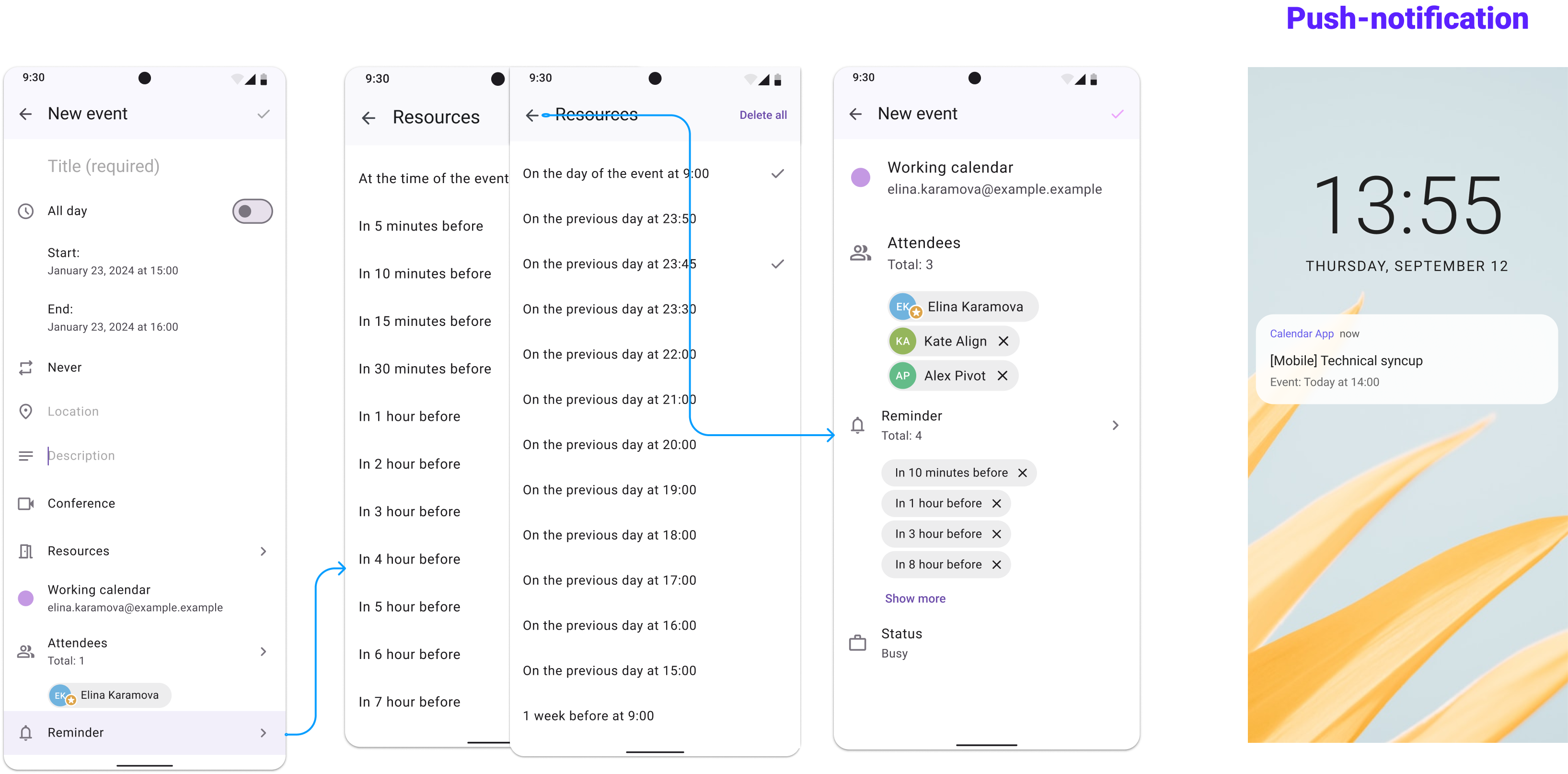
2. Tap on the fab button → the full event creation form opens with all fields available for filling. The screenshot shows the empty (min) and filled (max) state of the following fields:
- Title (required field, after its filling - saving checkbox gets active status).
- Switcher "All day"
- Start date
- End date
- Repetition
- Location
- Description
- Conference
- Resources
- Calendar
- Attendees (owner - set by default)
- Reminder
- Status
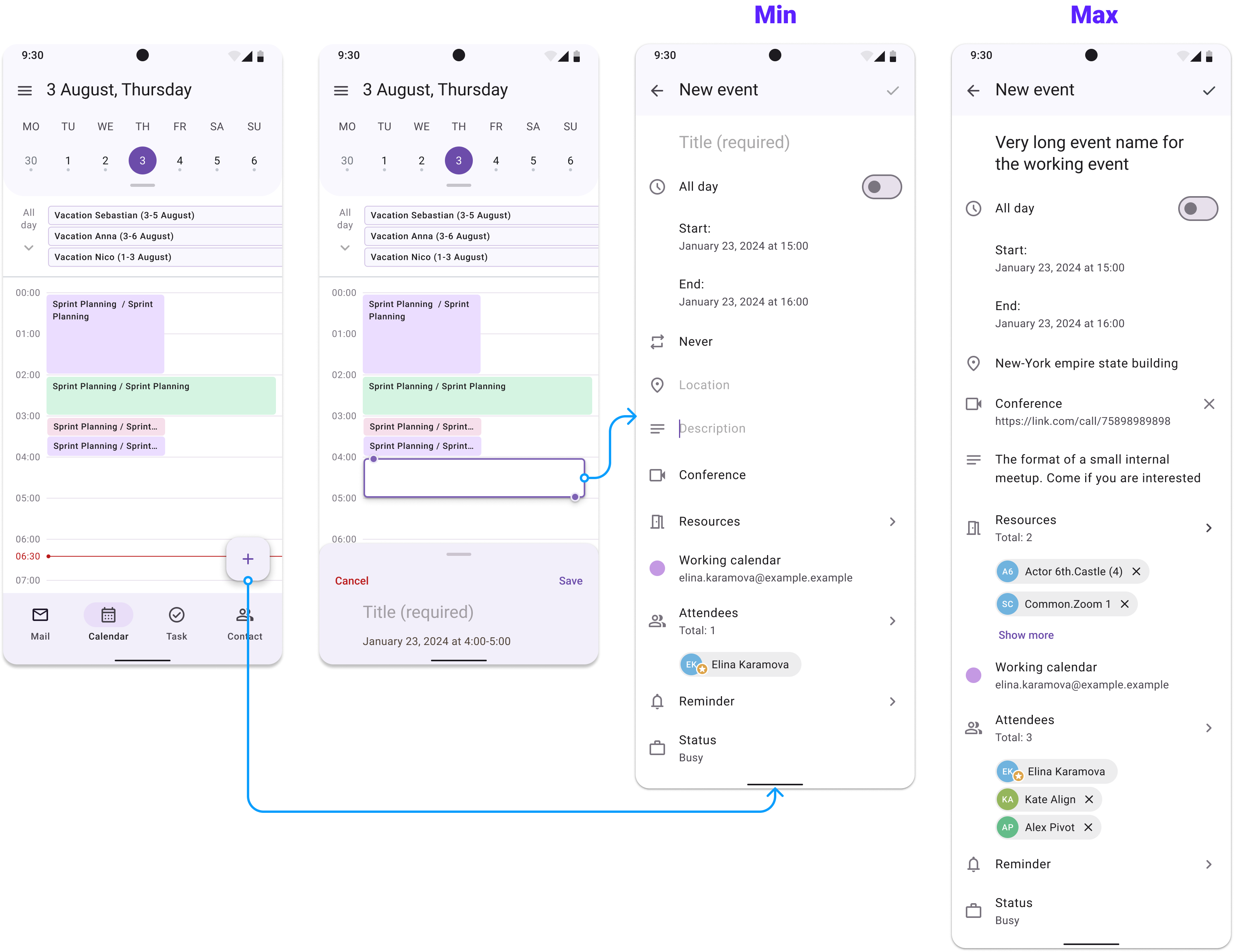
Below will separately described the operating principles of UX and UI patterns of certain fields that have the most complex operating principle:
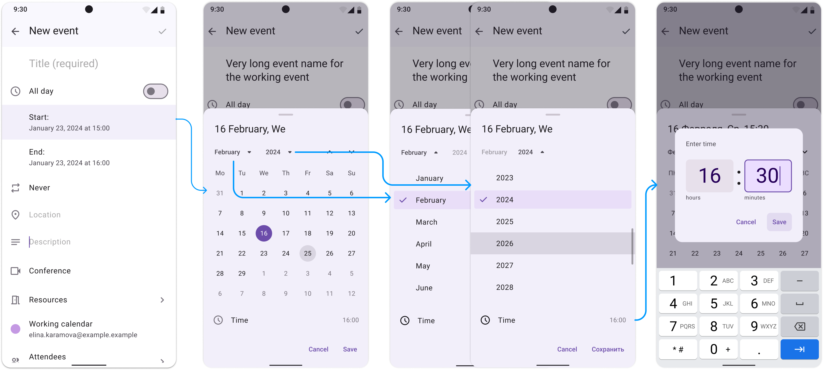
3.2.1 Start and End Date fields
- When a user taps on "Start" or "End" a Modal Date Picker in Bottom Sheet component, he can choice date and time.
- The user can scroll through the entire month by swiping up and down, as well as by tapping on Controls. For the Month and Year types, only swipe up and down is available. For Month and Year types, a scroll bar is displayed.
- By tapping on the select button, a list with months/years opens, where the selected month/year is highlighted using the active state and the check icon in the leading.
- When a user select a different month/year, it is also replaced in the select button label; and also the list collapses automatically after selection.
- When a user select a month/year, the other buttons in the Selection Row are disabled, but the year or month is always displayed.
- Year Limit: The list shows -5 and +5 years from the current year.
- If the user tries to set the end date of an event to be less than the start date, we swap them: set the early date as the start date of the event, and set the late date as the end date.
- When a user taps on "Time" in the Modal Date Picker, component Time Picker opens.
- Component allows to input time from keyboard.
- When opening Time Picker:
- By default, the current time is set.
- Time Input "Clock" is in focused state.
- Time Input "Minutes" is in the enabled state;a keyboard for entering numbers is displayed.
- For Time Input, only two-digit numbers can be entered, and, accordingly, the keyboard cannot be changed to alphabetical one.
- Corner cases:
- By tapping on an adjacent input, states change: the previous input applies the enabled state, and the active one — focused.
- At least one input is always focused, so the keyboard is always visible.
- In the Time Input of the hour it is possible to enter numbers only from 0 to 23, and if 0 to 9 are entered, then when switching to the minutes field or saving there, 01/02/03/04/05/06/07/08/09 is set.
- In Time Input minutes it is possible to enter numbers only from 0 to 59, and if 0 to 9 are entered, then when switching to the minutes field or saving there, 01/02/03/04/05/06/07/08/09 is set.
- When a user removes a number from a field and switch to another field, the empty field is set to 00.
- When a user deletes a number from a field and tap the Save button, the value in this field is set to 00.
3.2.2 Resources and Attendees
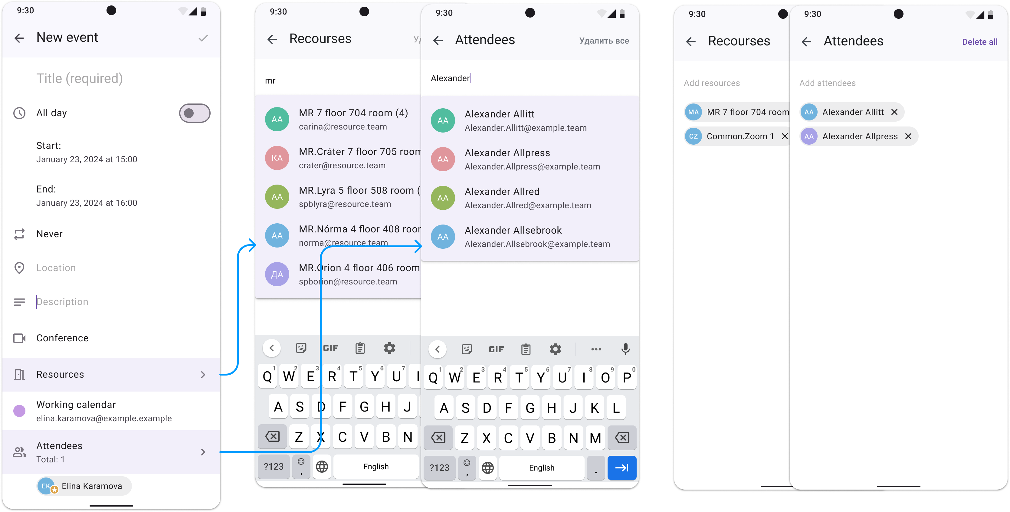
When a users taps on the item “Add resources” / “Add attendees”, a new screen opens.
Adding both resources and participants works in the same way:
When focused, the field displays the Suggestion component with a list of all resources in alphabetical order. When a user enters text into a field, the results in Suggestion are filtered according to entered query.
- A user can enter the full address of the resource or select it from the list. If a resource is added to a field, it is not displayed in the Suggestion.
- If the resource/participant is not found, the text about it is displayed.
- After leaving the page for adding resources/attendees, resources/attendees are added automatically (without a confirmation dialog).
Corner case – If entered email of attendees isn't valid, client will show alert about it.
3.2.3 Set the recurrence for event
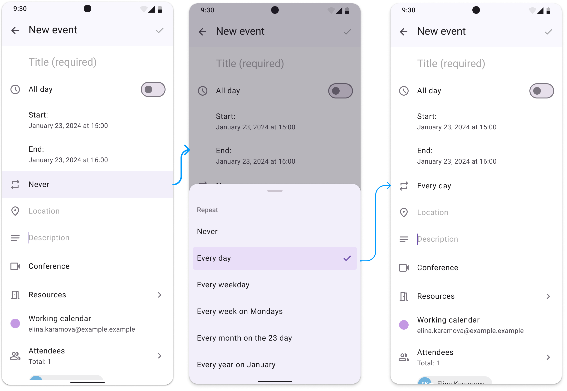
Limitation of the feature — along with the product owner and development restrictions, custom reminders were not considered, so the most commonly used repetitions were implemented. By tapping on the replay field, in this version a bottom sheet with the following options is displayed:
For events whose date and start are within the same day.
- Doesn't repeat
- Every day — from Monday to Sunday
- Every weekday — Monday to Friday
- Every week on [WeekDay] — WeekDay is substituted according to the day of the week of the date
- Every month on the [Nth] day — number N is substituted from the “Start” field
- Every year [Nth month]— day and month are substituted from the “Start” field
For events whose date and start are on different days — only the start date of the event is displayed on dat, weekday and month positions. The preposition "on" changes to "from".
For events that have the “All day” switch enabled — events are displayed in the events area for the whole day.
3.2.4 Reminders
Limitation of the feature — along with the product owner and development restrictions, custom reminders were not considered, so the most commonly used repetitions were implemented. By tapping on the remainder field, in this version a bottom sheet is displayed with the following options:
For single and recurrent events in one day:
- At the time of event
- In N minutes before (N from 5 to 30 with step=5 minutes)
- In N hours before (N from 1 to 8 with step=1 hour)
For events with duration longer 1 day:
- Event day (09:00)
- The day before HH:MM
- In 1 week
For all day events:
- If the event is on the same day - repeat options are similar to events in one day.
- If the event is on different days - repeat options are similar to events whose duration is longer than 1 day.
Depending on the reminder set, user will receive a push notification on their mobile phone (shown in the last mockup).
3.2.4 Calendar and Status
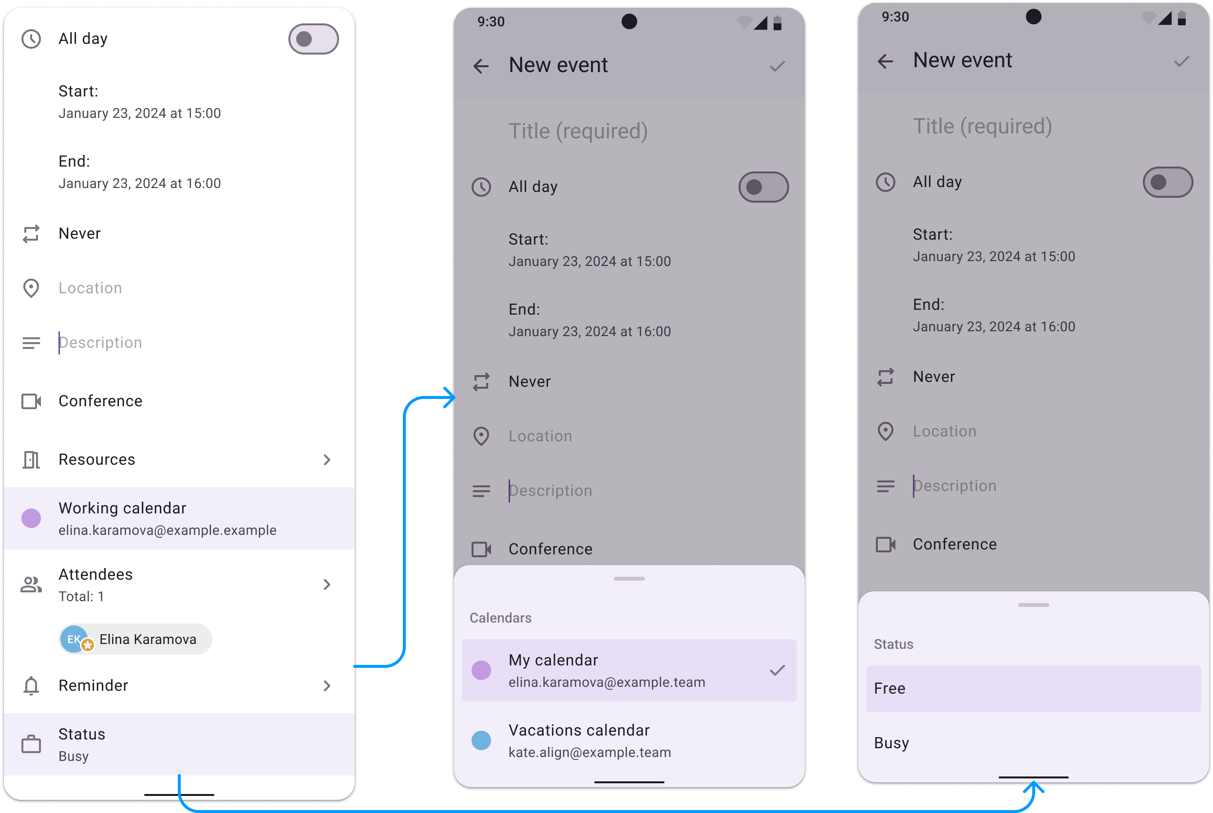
For setting both Calendar and Status using the Bottom Sheet component.
Calendar — by default the event is created in the default users calendar, but in the Bottom Sheet user can change to another one while creating and editing event.
Status — have Busy/Free options. If user set status busy, then another will set busy timeslot for set event there.
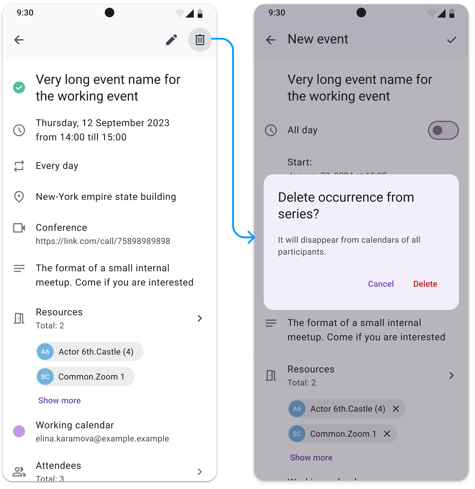
5. Viewing event mode
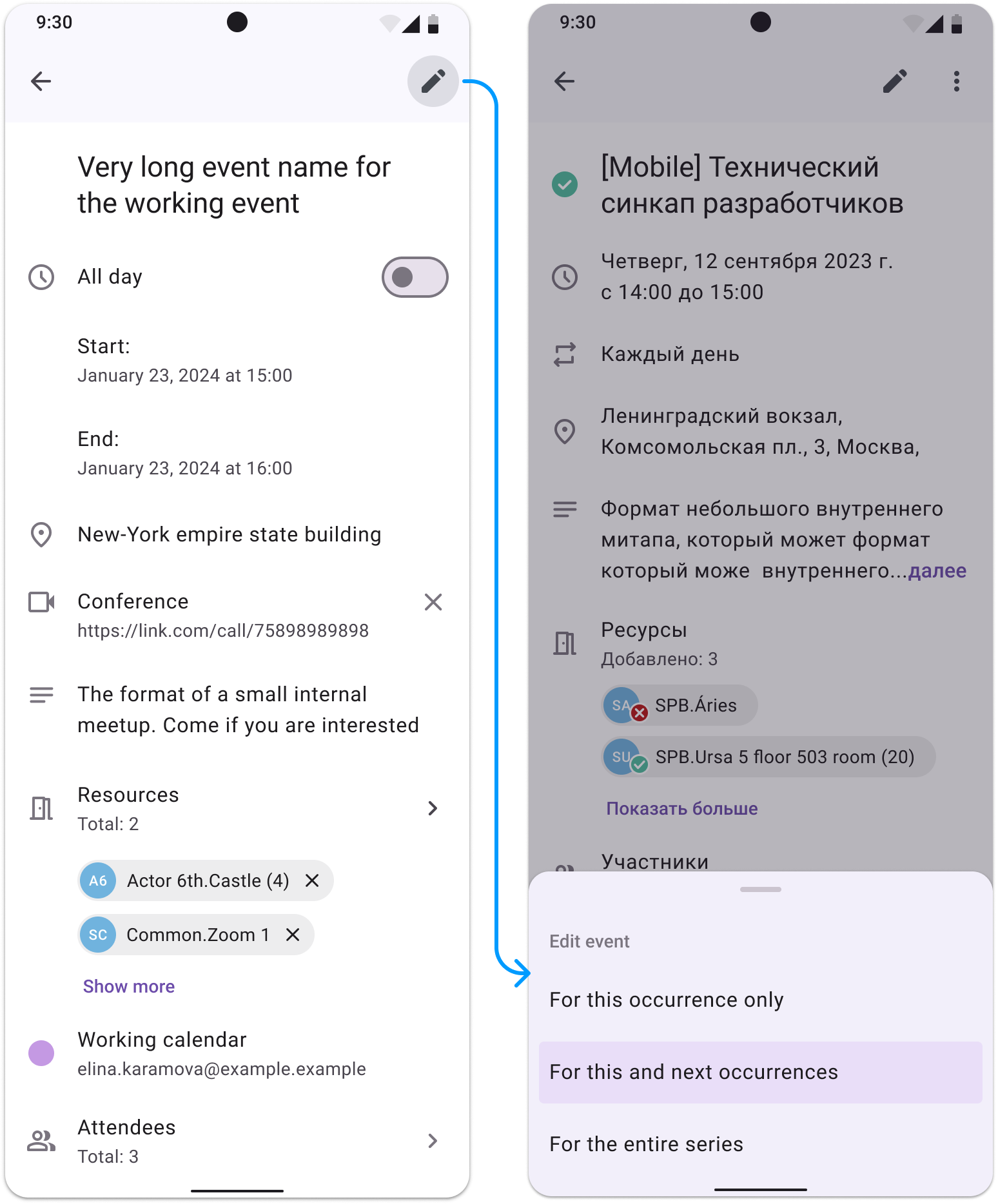
Users some functionalities depends on their roles:
- If user is owner of event or has full edit permit, he can edit all fields of events by tap on icon in the Top Bar.
He can chose for edit: this occurrence only / this and next events / the entire series.
- If user is invited to event, he can answer to event / set reminders / set status.
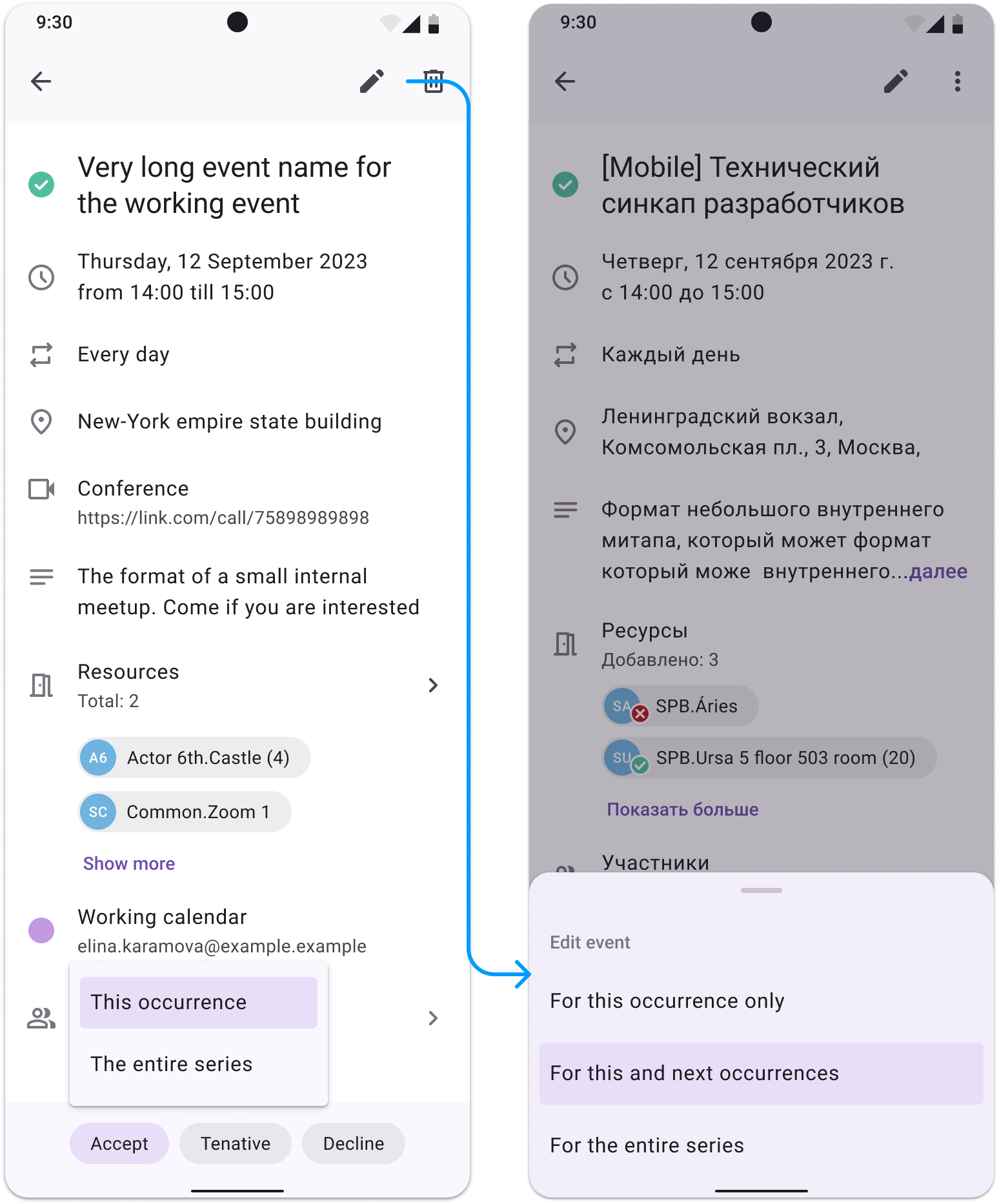
- For both users delete option is available. But owner while deleting will see dialog with warning.
3.3. Analytics
- User Acquisition:
- Goal: Achieve 600 app downloads and installations in the first year.
- Current Status: Successfully reached the goal of 600 users.
- Active Users:
- Goal: Maintain a 50% active user rate (at least 300 active users).
- Current Status: Currently, 298 out of 600 users are active, achieving a 49.67% active user rate.
- Retention Rate:
- Goal: Achieve a monthly retention rate of 65% or higher.
- Current Status: The retention rate of the Calendar App is approximately 50%.
- Engagement Metrics:
- Goal: Users to create and complete an average of 6 events per week.
- Current Status: Tracking shows an average of 4 events saved per week per active user.
3.4. Plans for the future
- Expend functionality with adding new features for improve user experience and ease of use (integration with Emails and Todo, adding another type of viewing - month, day, schedule, etc).
- Release of the application to the Android and iOS mobile stores.
- Make usability-tests based on users feedback and improve features.
- Use analytics for increasing Retention Rate metric.
Results of project
The Calendar mobile app project was designed to enhance productivity and streamline event management for users. Spanning from 2023 to 2024, this real-world project involved a cross-functional team, including a product owner, programmers, and designer Elina Karamova. We achieved the following results:
Design Goals:
- Market Differentiation: The app stood out in the competitive B2B market by addressing specific pain points that were identified during the user interviews. This helped in creating a unique value proposition, attracting new users, and maintaining a competitive edge.
- Event Management: Implement features for creating, editing, and organizing events with options for setting reminders, recurring events, and notifications.
- Enhanced User Experience: The app differentiated itself in a saturated market by offering superior usability and functionality. Key features, such as easy navigation and intuitive interfaces, were designed based on user feedback, leading to higher user satisfaction and retention.
Business Achievements:
- User Acquisition: Successfully reached the target of 600 downloads.
- Active Users: Achieved a 49.67% active user rate, nearly hitting the 50% goal.
- Retention Rate: Attained a 50% retention rate, below the 65% target but showing solid user engagement.
- Engagement: Users completed an average of 4 events per week, with a goal of 6.
Future plans include expanding functionality and integration, coming to Android and iOS stores, refining features based on usability tests, and leveraging analytics to enhance user retention and engagement.