Designing Todo Mobile App for managing work tasks
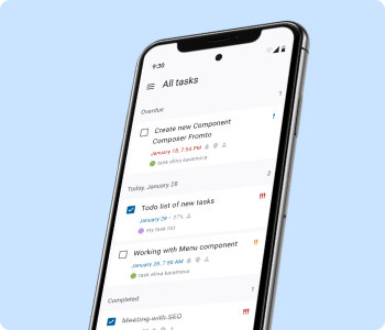
project bio
Project Overview: Create a user-friendly ToDo app that helps individuals and teams manage tasks effectively.
Team and Duration: This real project was a agile-collaborative effort involving a product owner, a team of programmers, QA and one designer (myself, Elina Karamova). The project lasted 2 year (2022-2024).
Business Challenges:
- Differentiation: The challenge was the high number of ToDo apps already available in the market. It was necessary to determine our ToDo app's unique position through user-research of different segments: our internal company employees and the business.
- User Acquisition and Retention: Attracting new users and retaining them by offering superior features and a better user experience.
Limitation: The presence of authorization using two servers that have different functions required the correct combination of functionality.
Design Goals: Implement features that enable users to easily create, edit, and organize tasks and projects, with options for setting priorities, deadlines, reminders and sharing option. Core Features:
- Task creation and management (with priority levels and due dates).
- Project grouping to organize related tasks.
- Notifications and reminders.
- Collaboration lists with tasks for team-based projects.
Users: Company employees managing self-creating working tasks, groups collaborating on projects.
Case content:
- Design process:
- Research
- UX/UI
- Analytics
- Plans for future
- Results of the project
↓
Design procces
1. Research
Goals: Learn about user requirements for a task management tool and use Job To Be Done framework to highlight the most priority functionality.
Respondents experience:
- Amount: 13
- Work with typical tasks/processes/activities of varying duration (from several days to several months) both independently and (preferably) as part of a working group;
- Use any means or tools to manage personal work tasks (in addition to a task tracker, if the organization has one) a tool with lists, lists of tasks, and the ability to record information on tasks, examples of services: Google Tasks, Google keep, Tick Tick, Todoist, Notion, Microsoft ToDo, Any.do, Minimalist, Apple Notes, Calendar or other;
- Not engaged in software development.
Method: Deep interviews + Usability tests of Lo-fi concept of interface. Duration = 1 hour.
Results: Based on research was highlighted the most important Jobs using framework Job To Be Done, here they are:
- When I learn new information from colleagues and highlight activities related to me
I want to quickly write down the keywords, what needs to be done, in the relevant direction
To:
- do not waste time on data entry and take them into account in your plans
- unload from memory and not be distracted from current affairs - When I received an urgent request or task
I want to do it right away and not put it off, since she can’t wait
To: not to waste time entering it into the tracker, and then not remembering about it - When I complete a task
I want explicit confirmation
To:
- I was pleased that the task was completed (note - psychological encouragement)
- I clearly saw that the task was closed among other tasks in the list - When I have
- there is background activity
- an idea has appeared that requires processing in the future
- something urgent that needs to be dealt with quickly
I want to start it without a deadline, in the form of an idea/note
To:
- just see the task and remember it
- notifications about being overdue didn’t demotivate me - When I have a large task (and it has sub-items) or I need to request status from colleagues in related activities
I want to mark to myself that work on it has begun
To: see it in its current status - When I plan my employment for the future
I want to spread out tasks for the coming days, with a horizon of 1-2 weeks
To understand immediate activities and employment, but not plan too far ahead.
2. UX/UI
Features description | Hi-Fi |
|---|---|
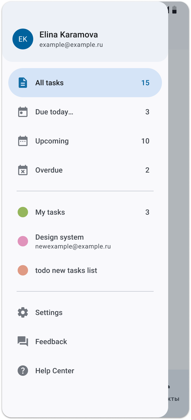
1. Navigation between lists of tasks Switching between lists with tasks is possible in the drawer or swiping:
|
 |
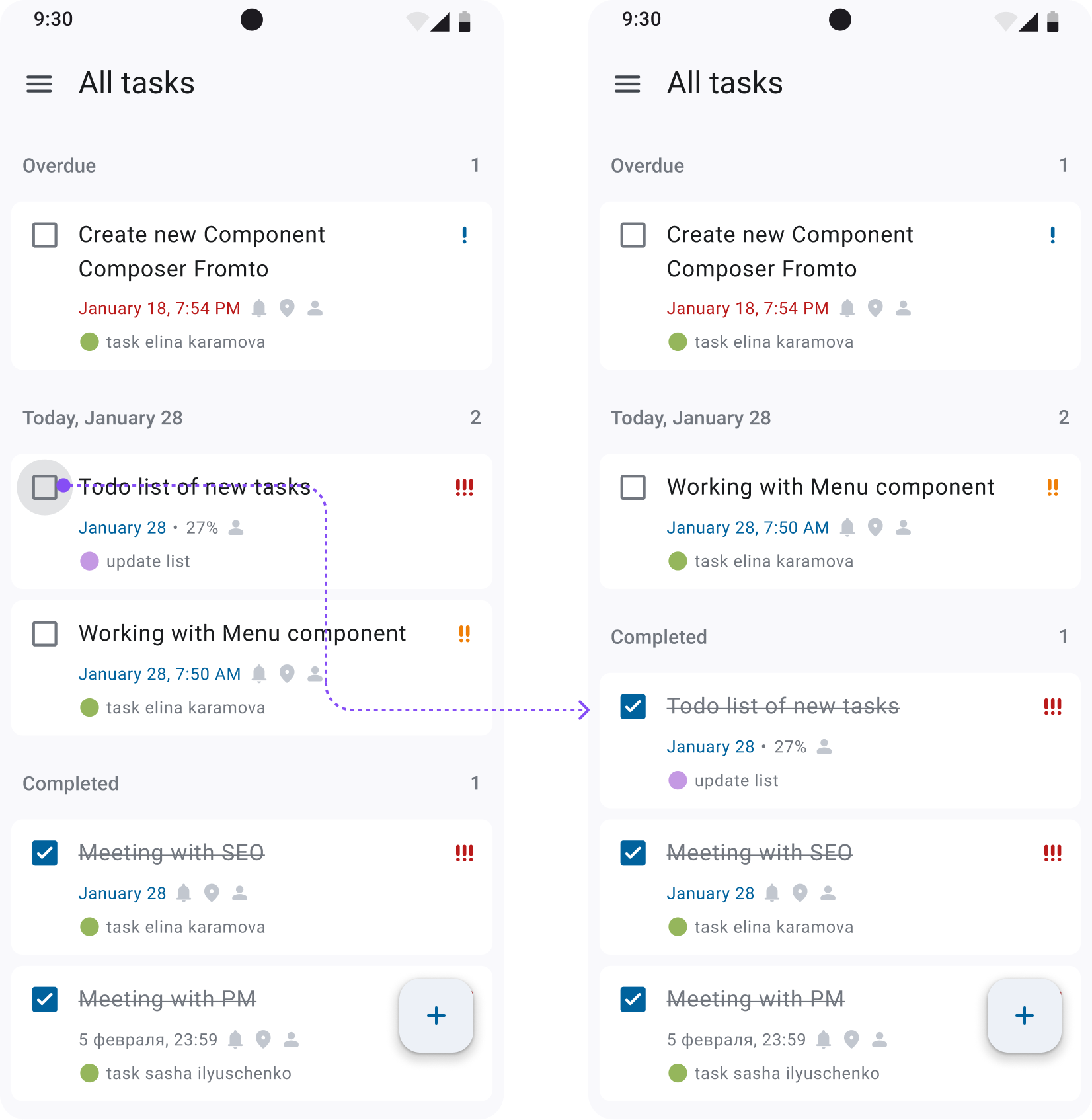
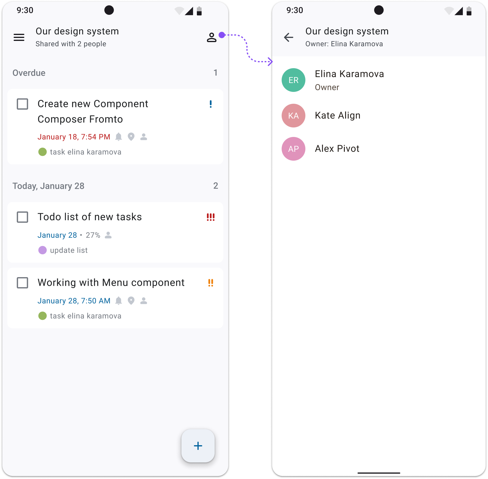
2. List of tasks
|
  |
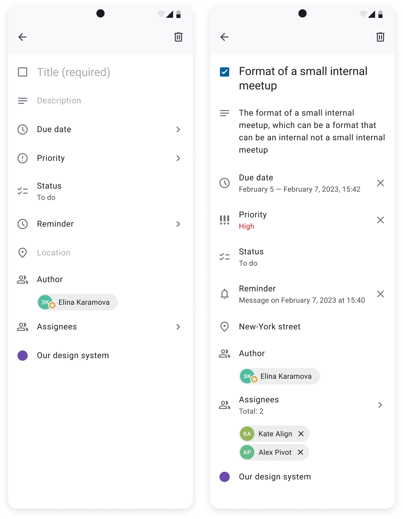
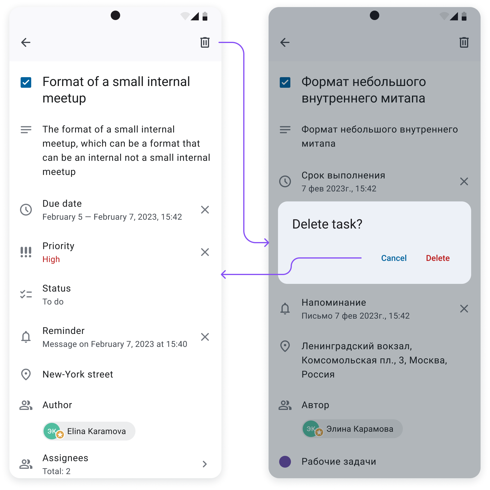
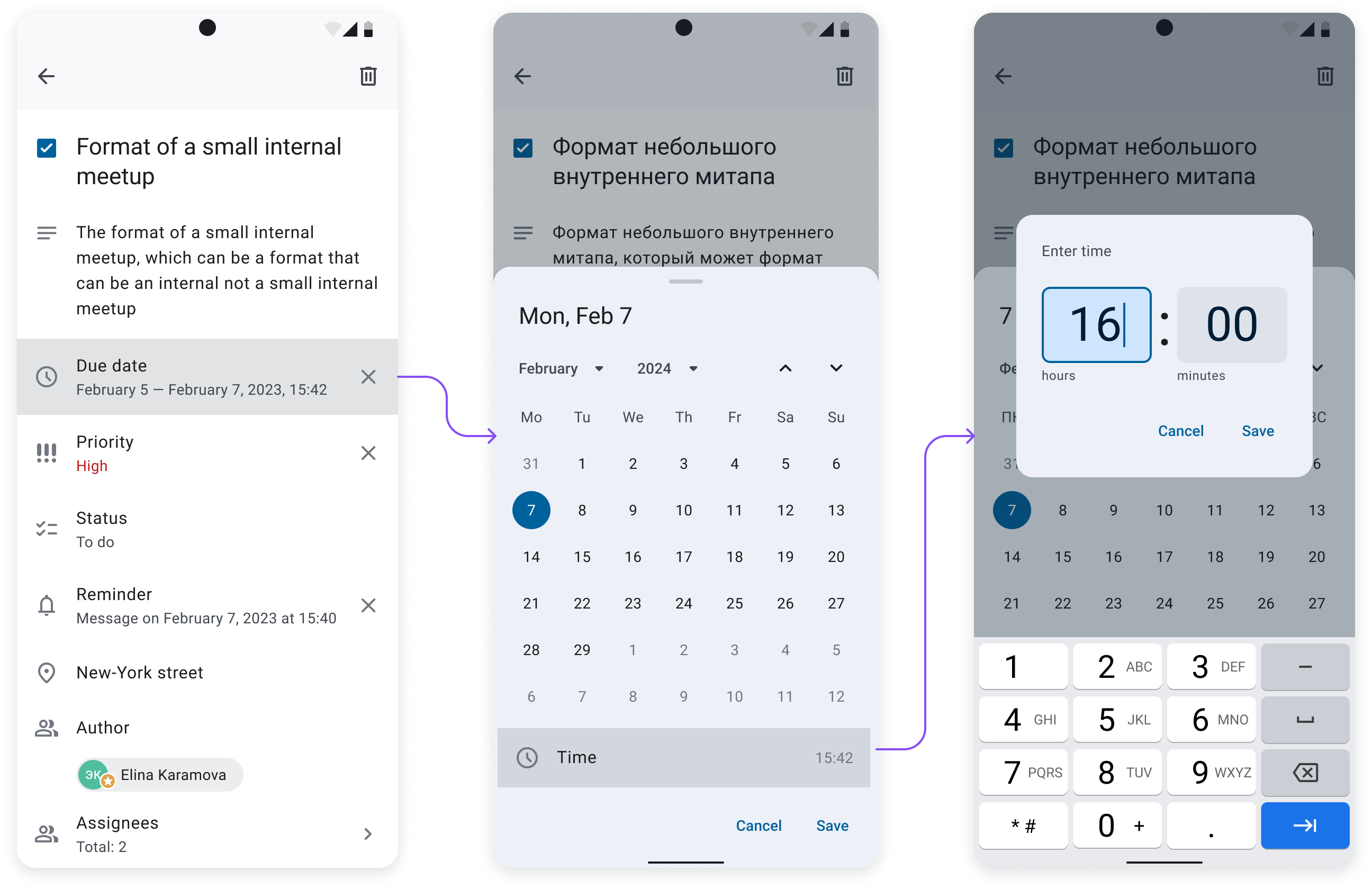
3. Creating and editing tasks Tap to FAB-button in the lists of tasks creates a new task. Every task consists:
|
   |
3. Analytics
User Acquisition:
- Goal: Achieve 600 app downloads and installations in the first year.
- Current Status: Successfully reached the goal of 600 users.
Active Users:
- Goal: Maintain a 40% active user rate (at least 240 active users).
- Current Status: Currently, 238 out of 600 users are active, achieving a 39.7% active user rate.
Retention Rate:
- Goal: Achieve a monthly retention rate of 60% or higher.
- Current Status: The retention rate of the ToDo app is approximately 39.67%.
Engagement Metrics:
- Goal: Users to create and complete an average of 5 tasks per week.
- Current Status: Tracking shows an average of 3 tasks completed per week per active user.
4. Plans for future
- Release of the application to the Android and iOS mobile stores.
- Make usability-tests based on users feedback and improve features.
- Use analytics for increasing Retention Rate metric.
↓
result of the project
The ToDo mobile app project aimed to deliver an efficient and user-friendly tool for managing tasks.
Spanning from 2022 to 2024, the project involved a cross-functional team and we achieved the following results:
Design Goals:
- Task Management: Implement features for creating, editing, and organizing tasks with priority levels, deadlines, and reminders.
- Project Organization: Enable users to group tasks into projects for better management and tracking.
- Collaboration: Facilitate team collaboration with shared lists and task assignments.
- User Experience: Ensure a seamless and intuitive interface for efficient task handling and minimal disruption.
Business Achievements:
- User Acquisition: Successfully reached the target of 600 downloads.
- Active Users: Achieved a 39.7% active user rate, near the 40% goal.
- Retention Rate: Attained a 39.67% retention rate, slightly below the 60% target.
- Engagement: Users completed an average of 3 tasks per week, aiming for 5.
Future plans include expanding to Android and iOS stores, refining features based on usability tests, and using analytics to enhance user retention and engagement.